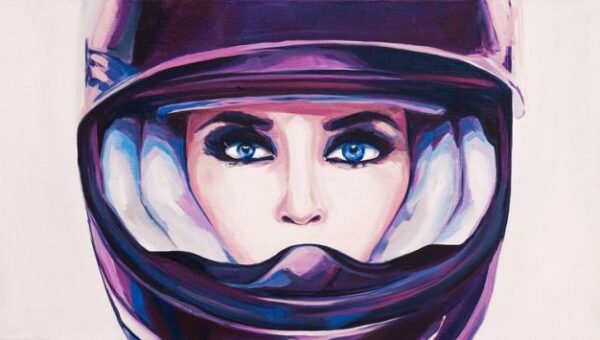
The Three Basic Colours in Painting
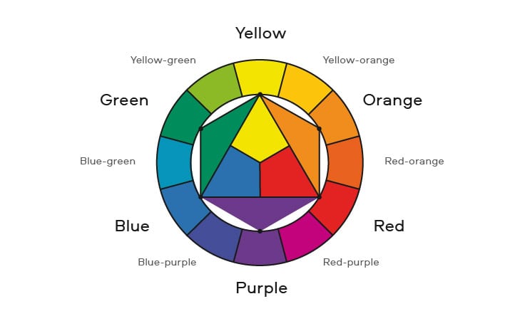
The first thing to make clear to yourself is that there are only three colours in painting that cannot be obtained by mixing others. These colours – yellow, red and blue – are known as the primary (base) colours. It is they that form the middle (base) of the colour wheel.
If you mix two primary colours, you get what is known as a ‘complementary’ (or secondary) colour. Red and blue at mixing give violet, red and yellow – orange, and, at last, blue and yellow give green. The specific shade of the secondary colour depends on which yellow, blue and red you use and in what proportions you mix them. If you mix a primary colour with a secondary colour, you get a tertiary colour.
Black and white also cannot be obtained by mixing, but they belong to the group of monochromatic colours and do not participate in mixing of chromatic colours.
Cold and warm colours
Each colour ‘leans’ towards one or the other. It is not always conspicuous, sometimes the warmth or coldness of a colour is barely distinguishable. But cool should be distinguished from warm, because when mixed, these properties have a serious impact on the result.
Among the basic yellow and red belong to warm colours, and blue to cold colours. In addition, if you make comparisons among types of the same colour, you will find that among the reds, yellows and blues there are warmer and cooler shades. However, it is appropriate only within the framework of comparison: yellow will never be really cold, but only colder than another yellow – otherwise it is no longer yellow, but some other colour.
If you move mentally along the colour circle, you can see that each colour has a relative ‘temperature’. When moving from the cold ‘pole’ to the warm ‘pole’ the “temperature” of a colour rises, and when moving in the opposite direction – from warm to cold – this ‘temperature’ falls.
The difference between warm and cold shades is very important to understand and grasp. Thanks to this knowledge it will be possible to faithfully convey the time of day – sunny day or bluish twilight, the right mood and atmosphere – sad or joyful, etc. In addition, it will help the artist to play competently on the contrast of warm and cold, which also has a very impressive effect in the correct application of colour in works of painting.